
A brochure, postcard or flyer has only a few seconds to get someone’s attention. If readers cannot quickly understand what the piece is about, they are unlikely to study it closely. Good print design makes the message easier to scan, understand and remember.
The following print design tips can help businesses create marketing materials that look professional and guide readers toward the next step.
Begin With a Clear Visual Hierarchy
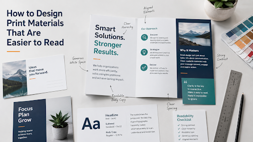
Visual hierarchy tells readers where to look first, second and third. The headline should communicate the main idea immediately. Supporting information can then appear in subheads, short paragraphs, captions or bullet points.
Size, placement, color and contrast establish this order. If every element is large, colorful or bold, nothing stands out. Choose one dominant message and let everything else support it.
Write for People Who Scan
Most people scan printed marketing materials before deciding whether to read more. Long blocks of text make that difficult, especially on postcards and brochures.
Break the copy into short sections with descriptive headings. Keep paragraphs brief and place the most useful information near the beginning. Lists work well for services, benefits, features and event details.
Clear writing also saves space. Remove repeated points, unnecessary introductions and technical language that customers may not understand.
Use Color and Contrast for Clarity
Color can organize information and direct attention, but it should not be the only thing separating elements. Light gray text on white may look refined on a monitor and become difficult to read after printing.
Use strong contrast between type and background. If copy must appear over an image, place it in a solid or lightly tinted area. Labels and headings should carry meaning without depending entirely on color.
Choose Readable Type
A stylish font is not helpful if people struggle to read it. Decorative typefaces can work for a short headline, but body copy usually needs a simpler font. One or two font families are generally enough to provide contrast and consistency.
Copy that looks acceptable when enlarged on a monitor may be uncomfortably small after printing. Consider the audience, viewing distance and available space. Materials aimed at older customers may require larger type.
Line spacing and line length also affect readability. Lines that are crowded together can cause readers to lose their place. Extremely wide columns make it harder for the eye to move from the end of one line to the beginning of the next. Brochures and newsletters often benefit from narrower columns that break the copy into manageable sections.
Use White Space Deliberately
White space is the open area around text, photographs and other design elements. It does not have to be white. Its purpose is to separate information and give the reader’s eyes a place to rest.
Filling every inch with copy, logos and photographs makes a piece feel disorganized. Reducing the number of elements can improve readability without changing the paper size. White space also draws attention to a headline, offer or call to action.
Keep Elements Aligned and Consistent
Headlines, paragraphs, photographs and captions should follow a consistent grid. Repeated elements, such as headings or product descriptions, should use the same type size, spacing and placement.
Consistency helps readers learn how the piece works and move through the information with less effort. It also makes separate pieces within a campaign feel connected. A postcard, brochure and sales sheet do not need identical layouts, but they should share recognizable colors, type choices and design elements.
Select Images That Help Tell the Story
Photographs should reinforce the message. An image of the product, customer experience or completed work is usually more useful than a generic stock photograph.
Images also need enough resolution for professional printing. A picture that looks sharp on a website may appear blurry or pixelated in a brochure. Custom Printing can review image resolution and prepare files for commercial printing before production begins.
Avoid stretching photographs to make them fit a space. Cropping an image carefully is better than distorting people, products or buildings. If text will appear near a photograph, make sure the image does not compete with the message.
Design for the Finished Format
Folds, binding, trimming and mailing areas affect how a design is seen. Important words or faces should not cross a fold, disappear into a binding or sit too close to a trimmed edge.
For a brochure, consider the order in which panels are revealed. The front should create interest, while inside panels build the message logically. Direct mail also needs room for the address, postage and postal markings. Planning early prevents awkward last-minute changes.
Paper choice matters as well. Glossy paper can make photographs and colors appear more vivid, while uncoated paper may be easier to write on and can create a softer appearance. The right choice depends on how the piece will be used.
Make the Next Step Obvious
Decide whether you want readers to call, visit a website, request a quote, attend an event or come to a location. Present that action clearly instead of emphasizing several different responses.
QR codes can connect printed materials to a landing page, video, appointment form or special offer. Give the code enough open space to scan properly and include a short web address for readers who prefer to type the URL.
Review an Actual Printed Proof
Colors, type sizes, folds and images can look different in print than on a screen. A proof reveals cramped text, weak contrast and awkward folds before production. Read it at normal viewing distance, scan the QR codes and ask someone unfamiliar with the project to identify the main message and next step.
Custom Printing helps Central Coast businesses produce readable postcards, brochures, booklets, flyers and other marketing materials. Contact Custom Printing to discuss your project, paper choices and production requirements.