

In the 1970s it was a big thing to see a television show in full color. Many of the regular programming slots were still running black and white as it was a lower cost production at the time. Color was premium, and the big network channels made a point to emphasize they had the ability to deliver TV programming in a full color spectrum versus other channels. Today, color is often taken for granted as a natural until it is not there, and then the absence in print tends to be extremely obvious, almost disturbing to some.
Understanding Full Color at the Printer Versus the Design Screen
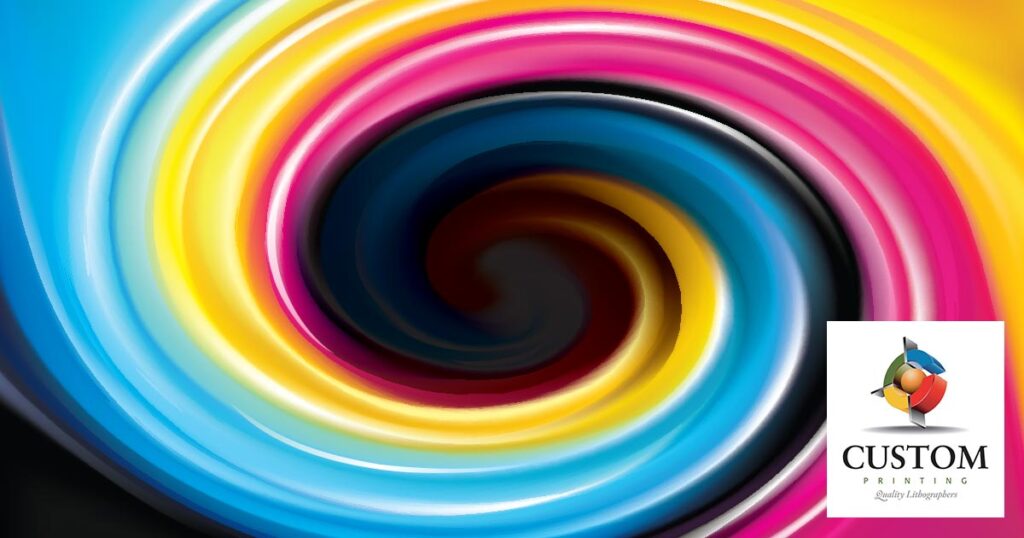
Modern color printing is enjoying the massive capability of advanced computer technology. However, the printing side of things still operates on a foundation of four-color printing. Aside from a few exceptions, most of the color printing involves some variation of four colors: cyan, magenta, yellow and black. These are otherwise known as CMYK printing. Every variation of color involves a mixture of these four colors or the absence of them (as in the case of white). Even with the richest intensities, CMYK coloring is still the fundamental platform from one printer to the next when producing full color output.
The above said, when preparing your image for printing, you are not bound to a CMYK format. In fact, it is quite possible and advisable to use an RGB color mode when preparing your image to send to a printer. Why? RGB gives you an extensively wider range of colors than what happens with CMYK. So, if you are looking for particular shading in your design development, you want to do that in RGB and then let the printer’s system convert it to the appropriate CMYK shade versus trying to build from the far more limited field of CMYK for the original image coloring. The difference will be notable.
Anticipate the Regional Settings Where You are Located
It is also important to make sure your image software is using the right regional settings. Whether its Adobe or other image software for pre-production, setting the right region will match your file output with the industry standards for that geographical area. For example, what works in Japan on the printer side can be very different than what is provided by a U.S. printer service. This can be a particularly surprising issue for folks who work internationally and move back and forth between different regions on a regular basis, working with multiple printers.
Avoid Blocky Mistakes
Use a high resolution when preparing your image for a printer. Low resolutions might seem more practical as they create smaller files which are easier to transfer. However, they also reduce the quality of an image tremendously. What ends up coming out in the print is an image with rough edges that up close look blocky. This is due to the low-resolution effect. High resolution, on the other hand, produces an image with clean details and edging. This is because the software is working at a much tinier detail level, and the same blocky effect is not occurring until one zoom in much further. The result is a larger file, but a higher quality image in print production as well.
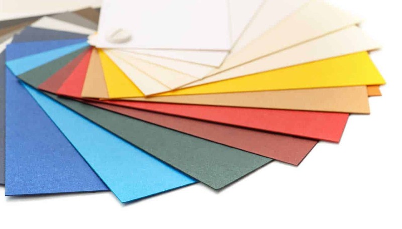
Remember the Mundane Things Like the Choice of Paper
Knowing the paper resource ahead of time can have an impact on your image and color choices as well. Many designers going to production specify the exact paper they want the printer side to work with. However, if you are not sure, then ask your printer ahead of time and test the variations with proof runs. For example, recycled paper will be an ink hog. It drinks up ink far more, which will increase the color saturation during the printing process. New paper will not have this effect and may come across lighter in comparison. Your software will not automatically account for this difference. You must know ahead of time what your printer is using for paper to anticipate the impact.
Communicate & Communicate Often
Too often folks drop off an order with the image files and do not follow up until the final production is delivered. Then they see something they do not like. Communicating early and often with a printer tends to be the key to avoiding a lot of these headaches. By making sure the printer is involved in the image production, what is to be expected and what is desired, the printer can point out what his or her capabilities are, what might be a hiccup from their perspective and what could be an advantage. These are all key factors one can act on and make decisions that improve the output overall. However, if you do not talk with your printer on a regular basis during design and production, many of these opportunities will not happen. Instead, the printer will get the file, try to go over a proof in as much detail as possible, and then will go to production. By then it is too late to save the job if there is something critical that was missed.
At Custom Printing Inc., we have been working with clients since 1975, producing full color printing for all types of image, marketing, advertising, and communication needs. When it is time to work with a full professional suite for your critical color print jobs, we are ready to get started. Give us a call or email at the initial stage of your project, and we can support your production all the way through to final print run. Full color does not need to be an extensive challenge. Custom Printing Inc. makes it easy and one of the most powerful ways to communicate for your business and project.